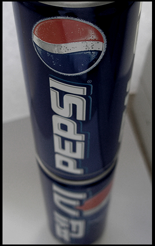
I almost challenged this one thinking you used two different photos and put them together with layers but, then realized maybe I just had a limited imagination and that you probably just had two different cans and put a clear item (glass or plexiglass) between them to make it look like that. Glad I didn't challenge. Great photo. Maybe a little more editing on the brightness and contrast.
7: Good idea but I'm not sure all the voters are going to notice the "reflection" is different from the can. The colours also seem a bit flat for DPC :(
I think the idea is nicely unique and the can is sharply in focus as the top but lacks "wow"
Nice! Always good to see a korean pepsi!! i like the simpleness to the image. also that slight desaturation is awesome! it would have been even better if that line on the right was gone! GOOD JOB!
Nice perspective. The tight crop and centered comp, however would limit my options for text placement. An adjustment to levels would add more "pop" to really bring out the presentation of product.






 Add photograph to your favorites
 Add photographer to your favorites


 Photographer found comment helpful.


