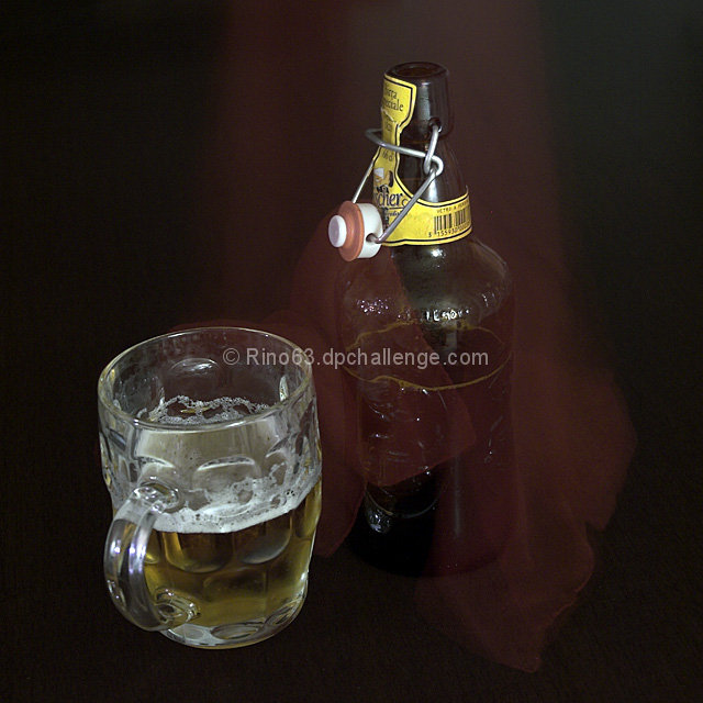
I like how you placed the mug and the bottle . I'm not sure what the cloth (?) down the center and around the bottle is though. It kind of takes my attention away from the bottle which for an ad is probably not good.
Nice comp and idea. This would work well with added text and for the purpose of brand reinforcement. The label should be more prominent. The added effect isn't exactly clear.
I really can't tell what's going on. It looks like a some kind of red cloth was over the bottle, then move partway through the exposure. What that has to do with the beer, is not evident. The label is not showing, what beer is this an ad for? I can't read the product name, a big advertising no-no. The glass looks dirty and the head on the beer itself is flat.
Image here is way too dark. It's very hard to see the bottle and then the mug isn't exactly in the best angle either.
Try using more light and lowering the camera some to get a better shot.
Is this a multiple or long exposure? There seems to be a "ghost" of a piece of fabric of some sort. Perhaps you mean for it to represent an "unveiling" or something, but to me, I find it distracting and confusing. :-/





 Add photograph to your favorites
 Add photographer to your favorites


 Photographer found comment helpful.


