Author Thread Comments Made During the Challenge
Post actions
...oh my!
Post actions
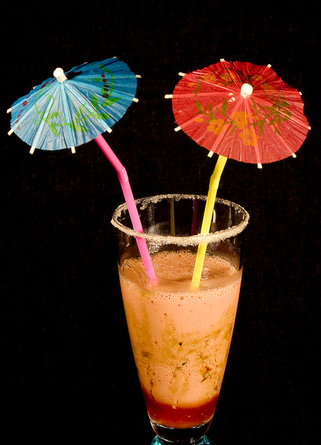
I like the comp and lighting. Text would fit well in this. Umbrellas add a tropical feel but....The beverage doesn't look appetizing. Perhaps you could've blended it bit more. Great start.
Post actions
Very unappealling. Perhaps if the bottom of the glass wasn't cropped off and maybe the angle was lower?
Post actions
I am sorry but that drink looks really gross. That is not something I would want to drink, which makes that not a very effective ad.
Post actions
Yummy looking drink. What class of beer or soft drink is this anyway? :D
Post actions
Post actions
Bottom crop is a little tight making it feel crowded. You did well with the lighting.
Post actions
i wouldn't drink that if i didn't know what it was, would you?
Post actions
prefer to see thw whole glass or cut off near the red at the bottom.
Post actions
The cropping/framing is too tight.





 Add photograph to your favorites
 Add photographer to your favorites


