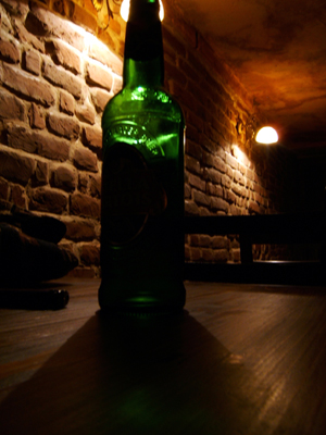
5: Good idea and the moddy lighting and brick background is good. I think you may have had trouble with the lighting in the room but the way it is doesnt work for me. I feel that something should be sharp (the bottle?) but nothing is.
I'm probably the 10th person to leave you this comment, but here it is anyway: the bottle is too dark. Maybe that's the idea or something. Composition here is in dire need of improvement. Also, use Save for Web and submit your image at the max allowed size. The lighting in this shot is actually pretty nice. If the picture were a decent size and you had something like a pocket flash light aimed at the label of the bottle, you'd actually have a decent advertisement looking image here. Good luck.





 Add photograph to your favorites
 Add photographer to your favorites


