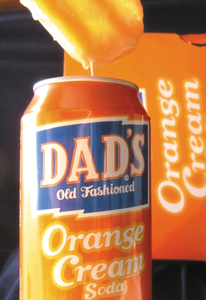
Nice colors that grab the veiwers attention Lighing is too harsh but the comp works really well and I really like the "WHats in it" concept. Definitely on the right track.
Potential here. Lighting is a little harsh on the left and the can doesn't come across as being sharply focused (I think it's the glare making the can look blurry/non-focused). The drippy thing up top seems to be part of the story but I'm not sure what it is. Is it related to the box in the back?







 Add photograph to your favorites
 Add photographer to your favorites


 Photographer found comment helpful.


