Like this captured. Great concept. Composed decent. Nice perspective. Good sharpness and detail.
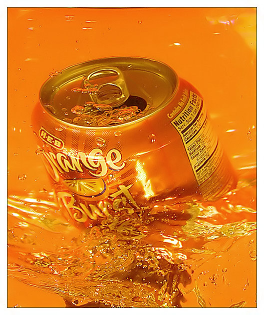
Like the idea to enhance the orange for effect, that makes a good marketing tool, but unfortunately the 'Nutrition Facts' display comes out making the orange color cast most apparent to viewers. Rotating the can to put that out of sight might be a good idea.
Certainly sends an 'Orange' message. Clean, well focusued and overall appealing. Trying to figure out the distortion on the top right of the can. It looks like the can is under two separate layers of water. I'll have to revisit after the challenge...hopefully you've told a little bit about how this was done. :D Good luck in the challenge.
Nice tones and sharpness. It catches your eye. (which is priceless in the world of ads) The only small thing I would ask is for a less tight crop on top to make the comp less centered and allow for text or logo.





 Add photograph to your favorites
 Add photographer to your favorites


