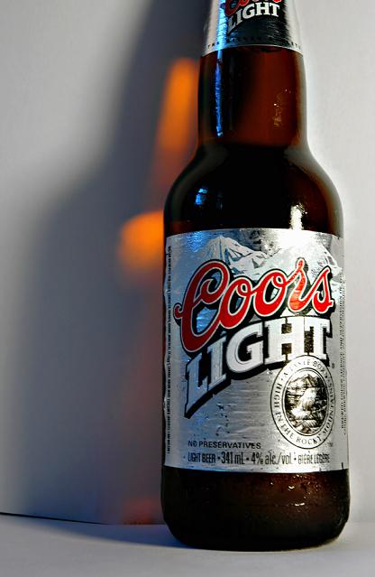
Nice lighting and you're on the right track as far comp goes. The comp here lends itself well to creative text placement. I'd use either a tighter or wider crop. One that would show the whole bottle or one that focuses more on the label. I like the bronze shadow.8
Got a feeling that cutting off part of the product is a pretty big no-no in advertising. Seam at the bottom of your background is trouble. Also not sure about the silver label and the white background. I do like the color behind the bottle, but I think a darker background would have worked better even if it meant losing that color. Good luck.
I like the color reflection on the background. The seam where the background materials meet is distracting (and totally avoidable). Lighting is a little strong and generating some glare. Might have had more impact if the entire bottle was visible. Best of luck to you in the challenge.






 Add photograph to your favorites
 Add photographer to your favorites


 Photographer found comment helpful.


