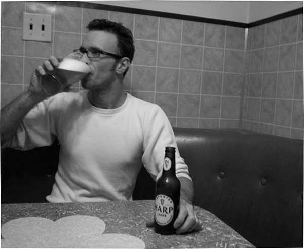
I like the way everything works together to give an impression of, oo, I dunno, 1960s? Table, chair, tiles, glasses, hair. I like the contrast. The man seems out of focus. There are several jpeg artefacts from making the picture too compressed, especially around the elbow, glass and table edge. The vertical lines are not vertical.
ok, the guy is enjoying his beer, but so what? this photo tells me nothing. it also leans a little to the right. it is also too soft, have either the beer or the face in good focus, preferably the face, but both would be good also.
I like the retro look this has. However, the photo needs more contrast (maybe a levels adjustment) and a tighter crop to bring more attention to the product being sold.





 Add photograph to your favorites
 Add photographer to your favorites


 Photographer found comment helpful.


