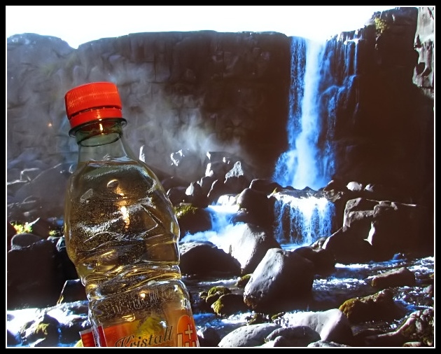
I was just about to submit this one to the High Contrast challenge when I noticed the soft drink challenge. I then added a bottle in front of my monitor and Voilah!
Well, I think it will probably do better here although it is far from perfect!
Wild guess 4.9
:-)
Quality in saving 93% to go undre 150kb
Statistics
Place: 110 out of 127 Avg (all users): 4.5340 Avg (commenters): 4.2500 Avg (participants): 4.5400 Avg (non-participants): 4.5328 Views since voting: 3139 Views during voting: 401 Votes: 294 Comments: 10 Favorites: 0
Great idea but photo seems set up in front of another photo. You do send the message that this is refreshing. Comp is nice but product should be presented more prominently (especially the entire label.) Existing comp lends itself well to text usage. And background is beautiful even if it is a photo.
Looks like held in front of a monitor or something, the bottle does not match the background (which is anyway kinda blown-out). A better background & better blending would have made a lot of difference.
Your sky is blown out. Waterfall is too blue. Oh, wait...that's only a backdrop isn't it. I don't know, when I think of IceWater I usually think of it being clear and crisp. With the way you've positioned this bottle and the backdrop used, the water appears yellow. All JMO of course. :) Good luck in the challenge.





 Add photograph to your favorites
 Add photographer to your favorites


 Photographer found comment helpful.


