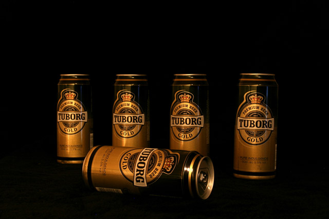
Let me start off by saying I like the composition of your entry. The can laying on its side give the image a strong focus point and sets it apart from many of the images in this challenge that showed a long line of beverage containers. I also like the gold coloration of the lighting, as it works well with the gold color of the cans. So why didn't this image score better? There are a few technical issues with this image that are easy to fix. First, the image looks a little flat. If you bump up the gamma in levels and bump up the contrast, the cans end up looking a lot more three-dimensional. Second, the focus appears to be a little soft. There are several possible reasons for this but the most likely is that the image needs to be sharpened more after reducing the size to 640 pixels. Most people us Unsharp Mask to accomplish this. If you did use USM after reducing the size, you may want to run it a second time. The third issue is the reflection on the can that is lying on its side. On the upright cans, the catch light is much smaller is size and is pleasing to look at. On the tipped can, the catch light effect is very large and distracting. The size could have been reduced or eliminated by rotating the can to change the angle that the light bounced off it. And finally, the dark space above the cans is a little large. Although this may be helpful for adding words to an advertisement, the image was being judge by photographers as a photograph.
Feel free to PM me if you have any questions regarding this critique or if you have problems understanding any of my comments.
"one down, four to go" might be a better title. no on second thougts, it's just pretending to be down, cheeky thing it is.
nice comp, but lacking that spark to give it live.
Classic job. I could easily place text above this and make a pretty nice ad.The lighting seems a bit dull but could probably be adjusted with the shadows/highlights adj in PS.





 Add photograph to your favorites
 Add photographer to your favorites


 Photographer found comment helpful.


