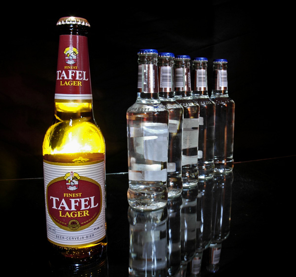
I agree, the light is a bit harsh but I like the clarity.
glad2badad, I agree, I wanted to remove the labels but I had little time! Also don't like the glass line in the background.
Next time I will not use a wide angle to eliminate the distortion.
And rswank, I agree, it is boring! Thought afterwards that some ice and maybe condensation on the bottle would have been nice and maybe some other lighting effects. Or some dry ice smoke . . Anyway, next time.
Nice idea and catchy tag line. Lighting seems a bit harsh but product presentaton is excellent. A little more room on the right would help with text placement. Very nice job overall though.
This would have been really really cool if you could have either lined up the labels or removed the labels (lower ones) on the background bottles. The seam where your background meets the glass is also a little distracting. Clever concept and message. Good luck in the challenge.





 Add photograph to your favorites
 Add photographer to your favorites


 Photographer found comment helpful.


