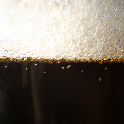
Like the concept a lot, but alas, it seems a bit washed out in the highlights, and a bit... just... not crisp and clean in the dark areas (too much reflection of stuff, or something, and/or glass not clean enough.)
A slight white balance adjustment would go a long way with this. there's a ton of potential here. With the proper tag line, well placed in the great comp/negative space of this photo, this could appear in almost any magazine.
why wouldn't you save this at 640px for impact??? at 427 pixels it makes it really hard to judge for sharpness...the idea is good and I love the bubbles in the dark areas, but at this size...5





 Add photograph to your favorites
 Add photographer to your favorites


