Author Thread
Post actions
Post actions
Post actions
i seem to recall giving this an 8 or 9 but my vote didn't stick. sorry. this is great!
Post actions
Aleks: very creative take. Congratulations on your 13th place.
Post actions
A very good concept. Pity it's too creative for the voters.
Post actions
Very nice shot. Congrats on your top 20 finish!
Post actions
You got robbed. No less than a #5 entry. Personally, comparatively speaking, this was ribbon material.
Post actions
Thought this would be in the top 3-5 Aleks...boo!
Comments Made During the Challenge
Post actions
I absolutely love this shot. Definitely thinking outside of the box.
Post actions
Great idea! Favorite so far! Keep up the good work!
Post actions
Post actions
So simple but so outstanding. Very pretty, very clever. Takes you right to the brand. A real eyecatcher.
Post actions
Post actions
Post actions
Post actions
Very neat, and original! I give you an 8!
Post actions
Post actions
That's the sorta surprise i was looking for !!! - great idea ... it takes a second to figure it out.
Post actions
Post actions
You should sell this idea. Excelent!
Post actions
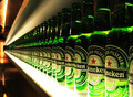
My compliments! I don't believe I have ever seen a beer with a "Head" quite like that! ;)
Post actions
very good idea, but use a brush next time and get a crisp result.
Post actions
Not sure about the title, but you've got a nice composition.
Post actions
Great juxtaposition. I could easily see this on the side of a bus, or in a magazine.
Post actions
Love the title and the concept!
Post actions
very cool concept here.
Post actions
Post actions
It is definetly different...
Post actions
Post actions
Post actions
Cool idea! Your lighting is well done.
Post actions
Great idea!! Needs a litte more contrast. A little stronger light maybe.
Post actions
Very clever. I can actually see this in an ad. Imatinative!! 8
Post actions
Post actions
Post actions
Post actions
Post actions
This would work well if you're already familiar with the product. Good for inage reinforcement. Nice lighting and enough "negative space" for text. However, I don't believe it would be effective for "new" markets.
Post actions
Great shot, great Idea, great color contrast. One of the best in this competition (clever title btw).
Post actions
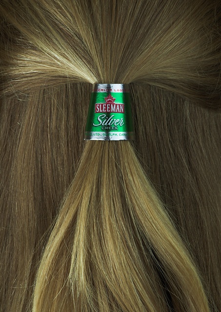
very creative, hair needs some more saturation and a more yellowish tone
Post actions
that's super clever...we have a beer company that produces a beer called BLONDE in Australia..perhaps you should send them this image as an idea...great image 9
Post actions
This is something I'd expect to see in an ad. 10!
Post actions
Now this is creativity! A bright spot in what has been kinda dull voting :-)
Post actions





 Add photograph to your favorites
 Add photographer to your favorites


