nice concept, wish I could tell you how but a little work on your lighting might help. a bit to bright from the right, a little futher away from your background. Good luck, keep trying
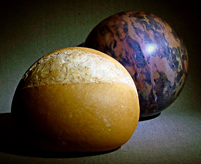
Perfectly on target with the theme. Great idea/title. Nice composition, balance and crop. Sharpness seems almost on the plus side but too close to call. My only suggestion would be to play around with a little "rockier" looking rock that was closer in color value to the roll. Might be be interesting to have more of the contrast in the subject and less in the color, but that's just an idea. Really good work. Score 9!
Nice play on words. Focus and composition is excellent. The lighting is good except for the hot spot on the rock which is a tad distracting. Love the color and slight textured background. The hearthy color goes well with the rock and roll. Hope this one does well.
Forgot to mention how I liked how you took two unrelated objects and showed how they are related because of their similar shape and size. Well done.





 Add photograph to your favorites
 Add photographer to your favorites


 Photographer found comment helpful.


