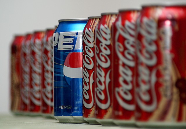
i would have added 2 or 3 more cans at the end to give it an "infinity" touch. to be nitty gritty about this, i would have used a more picture perfect Pepsi can. good DOF. above average. 7
This photo is great. The title doesn't make it clear to me which one you're promoting though. To me the photo without the title promotes the Pepsi so I might have titled it "The stand out" or "Outstanding" or even maybe a play on where the focus is and say "Change your focus to Pepsi and be a standout". I don't know I'm not an expert or anything it was just some ideas because I like hearing what people think about mine -good or bad but, something constructive.
Nice lighting and presentation as well as DOF that focus on the product. I always like contrast ads like this. Only detractions are reflection on the pepsi can and too tight crop that doesn't leave room for text. Still very nice. 8
Not sure how this works as an ad. 8 cans of the competition and 1 of your won eh? Setting that aside, the Pepsi label should be displayed in full (if you're making a Pepsi ad here). Composition would work better if cropped so there was no whitespace on the left side. DoF is nice though getting ALL the coke blurred out would have been even better. Overall not bad, good luck.
excellent composition, but I think the technicals could be better. The colors are a little flat on my screen, and the discolored white at the bottom contrasts the upper white to distract the eye. I still love the idea, and even though I like coke more than pepsi I'm giving it a better than avg. score. Good job, and GL.





 Add photograph to your favorites
 Add photographer to your favorites


