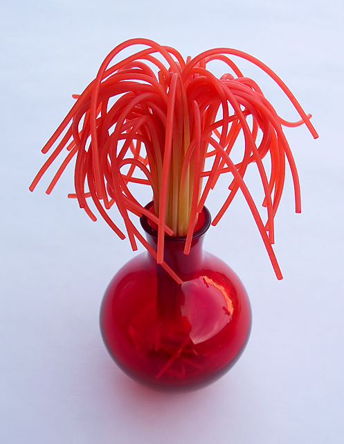
I might have tried to strenthen it in two ways. I think that the reflection off of the vase is distracting. If I had thought of it, I might have pulled the drapes closed or in post production cloned it out.
The socond improvement that crosses my mind is that the blueish tint to the white background melts a little of the excitement. A glossy white background might just make your subject jump from the page. I might have tried white balance in camera, or in post production painted it.
Most definitely not. Kinda looks like dreadlocks to me. :P This photo screams unrelatedness so congrats there. The technicals are ok but lacks anything special or unique.
What a clever idea! THat IS spaghetti, right?
I wonder if using a color other than red (or perhaps even several others) would have paired up even nicer with the red vase. Perhaps not.......
The white balance doesn't look quite right.






 Add photograph to your favorites
 Add photographer to your favorites

 Photographer found comment helpful.


