Critique Club Review:
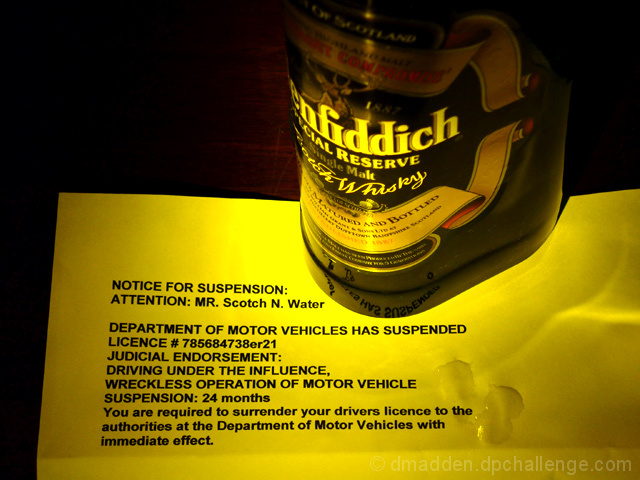
Focus is good. Color, saturation and hue are done well.
The lighting is a little harsh and the reflected highlights on the paper are a little distracting.
I'm not sure about the significance of the drops of liquid on the paper. Spilt whiskey? Tears? Drool?
I would have liked this better if the label were easier to read. You really have to work a bit to make out the word "Scotch". Rotating the bottle a bit would have helped. As would have a shallower angle.
I noted the title was defiance. Perhaps a poured glass of scotch would have been in order. Or even a partially consumed, or almost empty glass would also help communicate the notion.
Interesting start on a composition with some potential. |





 Add photograph to your favorites
 Add photographer to your favorites

 Photographer found comment helpful.


