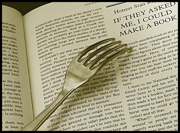
A good idea - I think it would work better if the fork were just a bit more to the right and lower, though still at an angle. The lettering seems to have halos around it - not sure if this is from sharpening or not.
clever shot - very nice. The only thing I can see is that the fork tines don't seem to be perfectly sharp... maybe it's just that they're darker. Anyway, good job!







 Add photograph to your favorites
 Add photographer to your favorites


 Photographer found comment helpful.


