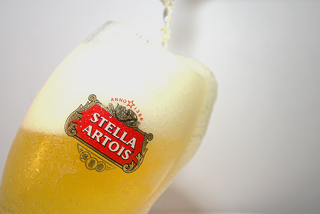
1) Open Beer - Stella Artois (known to many in the UK as Wife Beater)
2) Convert the taken shot from RAW to JPG in RSP 2006 in which I adjusted the levels and tweaked the saturation and vibrance
3) Open file in Photoshop CS2 and check the levels again to which I adjusted the white point to try and remove a few more unwanted shadows. (wish it was advanced editting!!!)
4) Auto Contrast
5) Added +2 lightness in Hue/Sat
6) Resized to 640x427
7) Save for Web @ 91 Quality to have a 140kb ish file
8) Drink Beer responsibly and enjoy !
If I had the chance to re-shoot this I would have a gap behind my beer glass and the white B/G with a light pointing up to try and rid the shadows. Ho hum...
Hope you enjoy the shot as much as I did researching and shooting this topic.
Statistics
Place: 41 out of 127 Avg (all users): 5.7763 Avg (commenters): 6.2353 Avg (participants): 5.4902 Avg (non-participants): 5.8361 Views since voting: 7689 Views during voting: 396 Votes: 295 Comments: 18 Favorites: 0
As we all know...Status costs you dearly!!!!!!! :)
Mighty nice-looking photo of some mighty nice-tastin' (I'm assumin') beer, since we've not been formally introduced yet.
Good composition, good concept. Lighting needs work and it looks like the top of the glass is overexposed or damn close. A darker background would help as would increasing the contrast overall via levels or curves. Not too shabby. Good luck.
6: A good shot but a bit blown out at the top. If this was deliberate then I dont think it works as it pulls my attention to the top of the glass and the OOF beer being poured whereas the logo seems to be the main point of this image the way it is
Great, great idea and comp. (Besides I really like this beer) Nice condensation makes attractive presentation. Foam,bubbles and pouring beer need to be a bit sharper. Comp lends itself well to text placement.





 Add photograph to your favorites
 Add photographer to your favorites


 Photographer found comment helpful.


