Hello from the Critique Club,
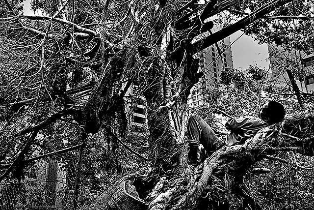
My first impression of this image when I voted on it was that it seemed extremely busy. Now that I'm looking at it for a second time, I can see I underrated it, as probably most voters did. The black and white conversion is extremely well done and the image has a ink dot drawing appeal to it while have a significant amount of gray tone. However, the busyness makes it difficult for the eye to find a place to rest and appreciate the image quality in the short time most voters look at an image. I realize that the clutter on the left side of the image is part of the story you are trying to capture but the voters had no idea it was from the aftermath of a typhoon. Therefore, it comes across as clutter. If you would have submitted this image with a square crop with the left side of the image removed, I feel that this would have scored significantly higher. It wouldn't have told as much of the true story you were trying to tell but it would have gotten a longer look and in the end, communicated more of the story to the viewer.
Feel free to PM me if you have any questions regarding this critique.
Tim
|






 Add photograph to your favorites
 Add photographer to your favorites


