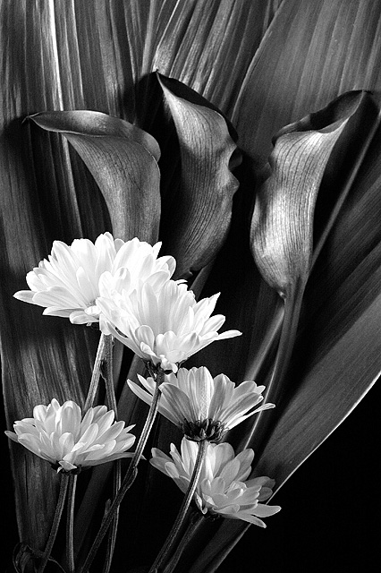
A stem of yellow mums in front of three black calla lilies in front of two big leaves of some sort that Michael at Pure Design thought would be different. In Color the leaves are varigates of green with red on the edges and down their middles. The contrasted nicely with lilies that read a burgundy red but the contrast was as good as I wanted. More complementary than high contrast. In color this would have blown out the yellows to where their detail would be gone for the most part. So BW it is. Sorry its floral but you should know by now that I have next to no imagination.
Post Layer adjustments for levels, brightness/contrast and hue/saturation. Layer of Curves. Convert to BW with layer adjustments for hue/saturation, levels and brightness/contrast. Sharpen. Resize. Sharpen.
Statistics
Place: 33 out of 396 Avg (all users): 6.2706 Avg (commenters): 8.0000 Avg (participants): 6.3158 Avg (non-participants): 6.2340 Views since voting: 1000 Views during voting: 238 Votes: 170 Comments: 12 Favorites: 0
Looks like the color was just dropped out. The gray balance doesn't look natural. I've heard converting to Lab color in photo shop and droping the chroma channel would look better. Nice lines over all.






 Add photograph to your favorites
 Add photographer to your favorites

 Photographer found comment helpful.


