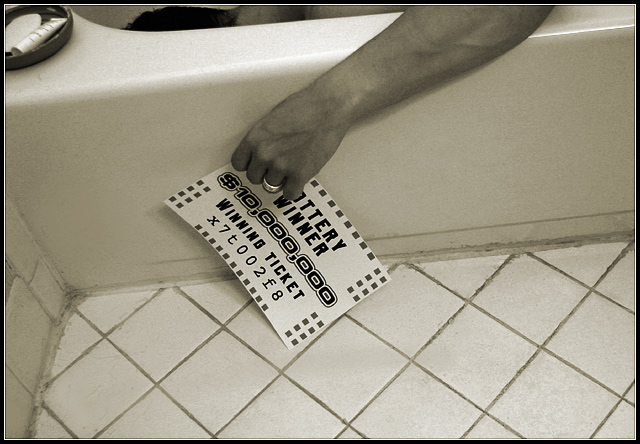
Should have the date on the lottery ticket, instead of the "10,000,000 Winning Ticket".
It's an off balance shot (much more white) with the only real element of contrast being the soap dish.
The ticket is in the center of the image (why would he have it in his hand?)
Overall, I think it's a 3. Better placement and cropping would have yeilded you a higher score.
The position of his arm doesn't look natural, it isn't believable that he is suppose to be dead (which I assume is what you are trying to convey) Maybe him laying in the tub with the ticket lying next to it would have been more effective,.
good effort. I would make one suggestion to show more of the upper torso of the main subject and straighten the shot a little. Just a thought. Nice work.
A good idea. Very ironic. the composition feels awkward to me. I'd like to crop at the left and get to see more of what is above the top edge. It would help the viewer follow the idea of the picute better. Perhaps a little more light at a different angle too?
heh. was he 98? I'd like it slightly more if the composition was more...straight I think. ie. the line of bathtub and tiles formed a stright line and the curve of the inner bath was not there at the top. that's just me.








 Add photograph to your favorites
 Add photographer to your favorites


 Photographer found comment helpful.


