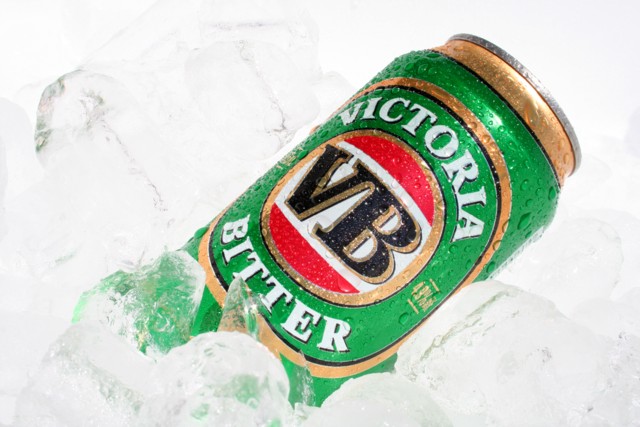
I'm guessing this might look a lot better on a darker screen than mine... it does seem that there's just a bit of detail in the bright whites, but I think it would look a lot better if there was more range there.
Nice attention to detail. I always like condensation on cold beverage ads. White balance adjustment could've helped bring out a little more detail on the ice. Comp works well for text placement.





 Add photograph to your favorites
 Add photographer to your favorites


