Now this is a building in disrepair! I will try to add more thoughts to this comment, but right now, I just can't think of anything "useful" to write. Color??? 6 Swash
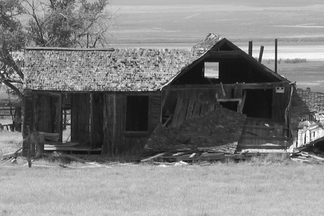
Good use of angle to show the light through the structure, thus illustrating the decaying nature of the old building. Same angle limits the perceived depth of the structure, though, and makes it appear a tad flatter than just the zoom alone.
Very nicely done! How was the color version? I like the lines of the sky. Can't decide if a tighter crop or slightly off center would be better....doesn't really matter, I still like this. 9 Ruthann
Something old. Use your photographic technique to emphasize the age of your subject. Composition - quite good Technical Aspects - good Meets Challenge - yes Visual Impact / Originality - good
several problems with this photo. the first is the lighting, it is just a bit too dark to get any detail in the walls. (they are in the shadows, and admittedly, to have exposed "this" shot to get detail in the walls would have washed out the remainder of the photo...catch22) the second is the composition. the straight-on... "here's a picture of an old house" look just doesn't interest me visually. third, the focus is a bit soft. the subject matter meets the challenge, it just wasn't presented in a very engaging manner, imo. I do like the black and white, however. ~mcmurma Aesthetics...4 Meets Challenge...5 Overall...5
Interesting concept of 'old' :) This particular image may need a little more contrast to really punch harder... I also believe an angle other than straight on would add some depth to the image... - jmsetzler
nice photo, but I think there needs to be more contrast so that the house doesnt blend in so much with the background. It is also slightly out of focus.







 Add photograph to your favorites
 Add photographer to your favorites


