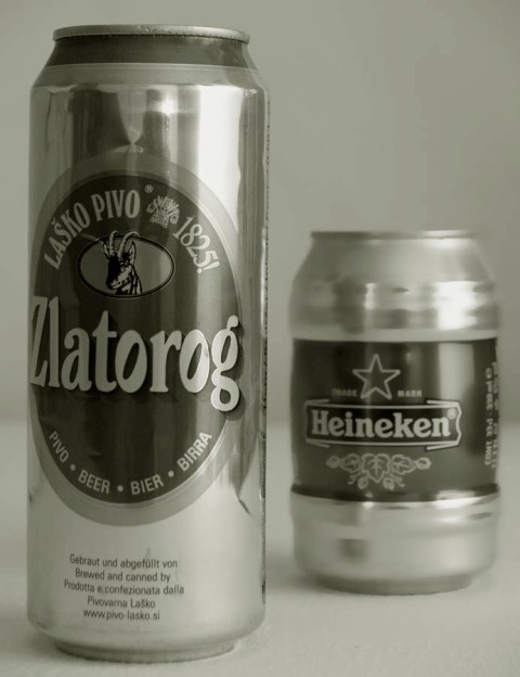
Very nice. I like the dof. It is enough to not distract from the Zlatorog but not so much that you can't tell that can in the back is a Heineken. The reflections are a bit distracting but overall nice job!
I like the duatone. The text could be a bright bold color and font to really grab the viewers attention. Comp works really well for the creative placement of test and the product is very well displayed.
I don't know who is bigger because you gave almost equal importance to both with your contrast and aperture. One should have been more out of focus than the other if you wanted to make one "bigger"





 Add photograph to your favorites
 Add photographer to your favorites


