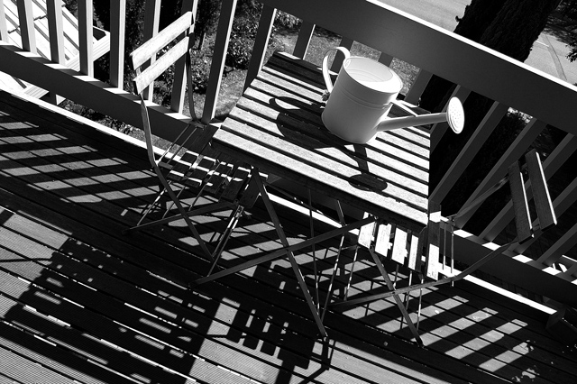
Shot on an nice sunny day as you can see. Not really happy with the top right part of this image and the rof tiles in the background. But I couldn't find a way of avoiding it without ruining the chairs/table/shadows composition.
Remove colours
Levels
Sharpen
Ironically increasing contrast made it loose contrast. Parts of the image got too dark. It lost the busy details of the table/chair frames, which I think added to the high contrast. So no contrast improved contrast!!
Statistics
Place: 195 out of 396 Avg (all users): 5.3392 Avg (commenters): 7.0000 Avg (participants): 5.2667 Avg (non-participants): 5.3958 Views since voting: 861 Views during voting: 223 Votes: 171 Comments: 6 Favorites: 0
Technical: Focus and depth of field are very good. Brightness, contrast, and lighting are done well.
Reaction: There are so many ways to look at this picture. I note from your comments that your concern was the play of the shadows of the table and chairs. Interesting... Had you not written that, I would have passed by what concerned you most. For me, the shadows, and the chairs, railing, and boards of the deck are almost overload. They all compete and interfer with each other.
What I really like is the simplicity of the can on the table. Had you been able to move the table into full light, and captured the can, table and tops of the chairs, you could have taken the can's shadow quite dark. At the angle of the photo you have here, I think it could have been a really good picture, with sort of an abstract art feel.
I love this. It seems so mundane at first but quickly stuns me into submission with its profusion of lines. Ultimately, it refuses to be representational, even though you keep being reminded of its mundanity. It's an amazing conceptual high just looking at this picture. 10
Like the observaqtion of those lines, and the capture of them - and you're right to include the watering can, as it gives reference to it all. The background through the fence probably lets it down - just brings it back to the humdrum too much, amkes the location too obvious, the composition too busy: such rhythmical compositions are often let down by the intrusion of the humdrum.
Interesting angle and use of lines. Not sure how much you changed in editing but I think the contrast could be higher because your darkest shade is in the back from the tree and I think something more in the foreground should be darker.






 Add photograph to your favorites
 Add photographer to your favorites

 Photographer found comment helpful.


