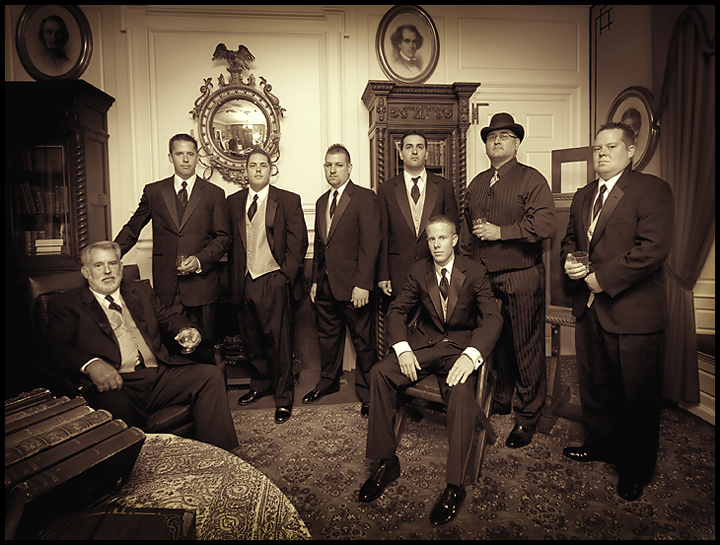
I scouted a church a couple weeks before a wedding, and saw this antique room there in the back of the church. So when the wedding came I knew what I wanted to do with it, and it turned out pretty much just about as I had imagined it. These are the groom, his father, the groomsmen, and the bride's father. Shot with 580EX on a flash bracket with Lightsphere aimed at ceiling.
Converted from RAW. Adjusted levels. I didn't like the distortion, but I was stuck using the ultra-wide due to a cramped room with no space behind me. Corrected (some) lens distortion using transform/perspective. Cloned out some distracting sunglasses on the table. Desaturate, use variations to get the desired sepia tone, and played with the yellow channel some more. Used Neatimage slightly to remove some noise. Created a vignette effect using elliptical marquee tool, inversing selection, set feathering to 200, and adjusting levels. Cropped, resize, usm, added border, save for web.
Statistics
Place: 63 out of 615 Avg (all users): 6.3618 Avg (commenters): 7.1667 Avg (participants): 6.2405 Avg (non-participants): 6.8293 Views since voting: 6082 Views during voting: 317 Votes: 199 Comments: 26 Favorites: 2 (view)
Nice "old school" kind of group shot. I like the setting. It seems to match the subject and treatment very well. The lighting, poses and expression are consistent and engaging.
My only complaint (not a huge one) is that the distortion seems extreme in places, especially on the man seated on the right. His forearms and feet look out of proportion.
Interesting study. The biology of mankind in the West has changed since the days that you are trying to depict. The 'gentlemen' in the photo would look more at home with cell phones on their ears. However, you did produce a nice composition with good lighting. 8.
This is different. Wow -everything from the carpet to their expressions has a vintage feel. The focus and tones are spot on! Well done. All the best in the challenge.
A striking photo. I would have moved in or cropped closer on the guys. Feels like too much space around the edges. Good job on the duotone. It has a really vintage feel to it.
cool idea. funny lens distortion though. the guy on the chair looks a little odd hehe. i think that i wold have taken the table in the corner out of the shot but hey, that's me. Well done and good luck.






 Add photograph to your favorites
 Add photographer to your favorites

 Photographer found comment helpful.


