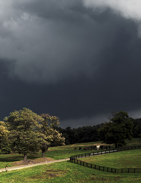
I took this picture out of a car window as we searched for a good place to pull over.
crop, curves, channel mixer in mono mode to take out some of the color, hue/sat to bring out the grass and trees while leaving the sky gray, resize, sharpen, neat image
here is the original, uncropped, resized with standard sharpening:
Statistics
Place: 17 out of 128 Avg (all users): 6.3086 Avg (commenters): 7.2778 Avg (participants): 5.9412 Avg (non-participants): 6.3741 Views since voting: 2516 Views during voting: 565 Votes: 337 Comments: 34 Favorites: 4 (view)
The title really helps this one. The horse stands out instantly. Without the guide from the title, the white horse just provides some contrast. The title makes it clear that the white horse is the subject. Very nice!
I explained what I liked about my own entry into this challenge in response to your comment. It would be interesting to hear your thoughs about this image.
First of all, my taste is far more developed than my abilities! :) The picture you thought was mine is indeed my taste. This picture was taken out the window of a semi-moving car, and I was amazed at the quality of the light. Not the composition, not the symbolism, just the light. So I cropped it and created a little frisson with the title, to make it more interesting. And there you have it. Certainly not my third favorite picture! But I'm glad to please people every now and then! :)
Notice we gave each other 6s, and our scores were just a little higher than that. I've heard it said the secret to a high score is to offend the least amount of people. I will post the original and I will *also* post outtakes that I think are more typical of my taste, and would have scored a full point lower, at least.
Hey, Don, and I gave *your* picture a 6, and it's your third best score and and a top 20 finish. :) So, we are quits, I guess. More than that, I was wrong thinking that this was your entry.
The sky is quite drammatic here, but this is the only thing that I like about this shot. Perhaps I am missing something. I think that the raising diagonal contradicts the "before the storm" atmosphere, and do not understand the purpose of that contradiction (was it intended?). The horses are but tiny specs in the image, and are stuck together.
I explained what I liked about my own entry into this challenge in response to your comment. It would be interesting to hear your thoughs about this image.
Can I just offer a "wow"? Really nice find! I love skies like this and they ain't all that easy to portray. Nice post work and exceptional use of the light at the right moment.
I don't really like the "implying rain" fad we have going on here with some of these pictures, but this is probably the best of all those, since it actually does look like it's just about to rain.
No rain yet, but holy cow! It's a coming!!! You've done a nice job composing this with nice use of image features to break it up (example, the road and fence for a diagonal line - same with the back tree line.). Good luck in the challenge.
I like the composition.
nice lighting, but a bit too dark for my taste.
Wonder how a "landscape" orientation instead of "portrait" for this one could have worked.
Lovely landscape that shows you *can* use portrait framing successfully. I would have used a different title as this one draws attention to a small speck of a horse when, IMHO, the grandeur of the storm clouds is the subject.
Not a spot of rain to be seen but the lighting in this shot is fantastic. I'd not have drawn attention to the white horse in the title as that simple enhances the "what has this got to do with rain" feel - I get it though :)






 Add photograph to your favorites
 Add photographer to your favorites


 Photographer found comment helpful.


