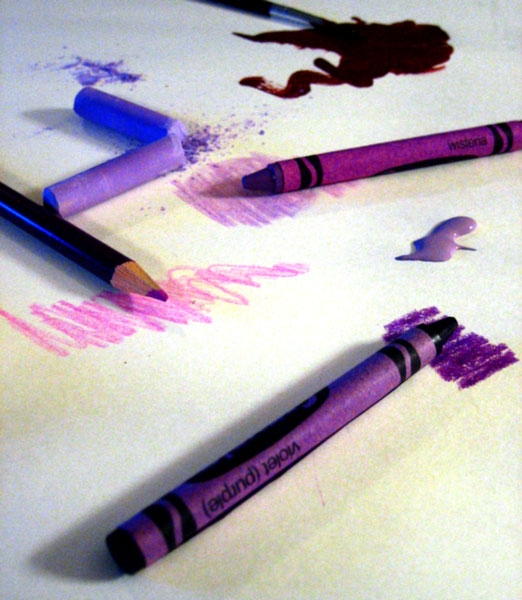
This is a good idea and I really like the different shades of purple. What probably kept it from scoring higher is the noise and shadows. It appears as if you have a blue light on the left, although it may just appear that way due to PP. The paint on the top of the picture looks more like a very deep red than purple. If you want to use existing light, you may need more of it to reduce noise.
Creative idea. Execution good: nice arrangement of mediums. However, the post-processing is too much, I don't know what term describes the blotchy background.
I like the idea here, unfortunately it's let down by the technicalities. There seems to be a lot of noise, either camera noise or from increased contrast (I reckon that this image actually works quite well if you dial the contrast down a bit, as then - to me at least - the text on the crayon stands out more).






 Add photograph to your favorites
 Add photographer to your favorites

 Photographer found comment helpful.


