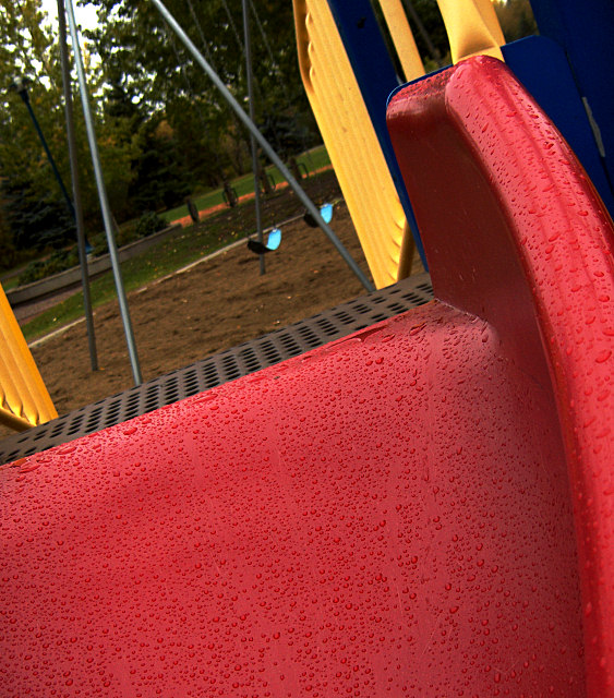
I think the red slider is overpowering in this image... I would either have less of it or more (maybe a macro of the water drops on those cool curves) of it, as is it throws the pic off balance, at least for me.
I wonder if there was a way to pare this picture down to just one or two things so that there was one subject. I like the color and the small drops on the red part.
Oooh the colours and contrast here is really strong! The great complimentary colours of the blue/red/yellow, the clarity and sharpness of the water drops and the tilt make this so strong. What I think will let it down in the voting is that a great deal of its impact is lost by too much detail in the background. This seems to draw the eye away from the real stars of the shot (photographically) which are the slide's elements. Maybe the swings are important to the story but I feel are less important to the photograph.
I would be really interested to see the result of you masking all of the background and putting a blur on it as if you'd used short depth of field.





 Add photograph to your favorites
 Add photographer to your favorites


 Photographer found comment helpful.


