Challenge:Irony (Classic Editing) Camera:Olympus D-450Z Location: Northern Virginia Date: Sep 29, 2003 Aperture: Auto ISO: Auto Shutter: Auto Galleries:Humorous Date Uploaded: Sep 29, 2003
I see what you are getting at here, it's just that for me this isn't photography taking a pic of a chart. But anyhow, on the technical side I would either have included those words at the bottom in your photo or left them completely out. Only having half of them there is a little distracting.
Hmmm, as a chemist, I'm surprised I didn't think of something like this myself (which is ironic to me). That being said, I think it would have been cool to show the "Fe" info stamped or represented on something like copper...
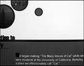
Whoa! A little too close I think. It blurred your image and added noise. I'd guess that this is an equipment issue. Know the limits of your camera. Even less fancy ones will take great shots if they're utilized right. This shot is inventive and my guess is that you were trying to convey that Iron's symbol has an E in it. Next time I'd try backing off a bit or altering your prop ahead of time to make editing easier. Hope this helps. Good luck.
I know the transition series all too well..them and their seemingly flubbed electron configuation. Im guessing you're focusing on the Rubidium's 4d75s1 orbital configuration? love the clarity of the shot, but Im not sure how it's really ironic...







 Add photograph to your favorites
 Add photographer to your favorites


 Photographer found comment helpful.


