Looking back at my comment (below) I realise how crass and insensitive it was. To suggest an image of an old veteran holding his medals makes an assumption that the brave soldier pictured was one of the lucky ones who did make it back. Apologies if I upset you back when I made my original comment.
Kavey
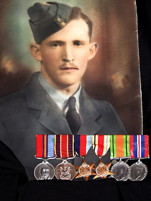
This is a wonderful image! I don't understand the cropping at the bottom, the metals are partly missing, plus the right edge of the shot has me asking why. Are the metals themselves a bit worn, I just can't see that as being a focus issue. Overall, nice job! 8 Swash
I'm not sure if the light from below at the medals was a good choice. For itself it looks good, nice contrast and very dramatic, but I think it does not fit to the photo in the background. It almost looks like the medals were put into the photo in postprocessing (what I don't think was actually done). But there is such a high contrast between the two subjects that it looks strange. Also in regard to the colors. The medals are highly saturated but the photo has very soft colors which really look old. Now it could be that this contrast was intended. If so then, well, I don't like it ;-) It also would be nice to see the medals completely. Instead I see the dark cloth or something like that. I also don't like that the right edge of the photo is visible. Anyway, it fits the challenge and it's a good idea. -stephan
I do like the idea, but the bottom of the medals are hidden and the photo isn't straight within the shot... otherwise I sort of like it... I would have liked even better an old man looking at his medals or some such...
the concept here is really nice... I think the edge of the photo being visible in the frame also adds a nice sense of 'old' because it is a bit tattered and torn... - jmsetzler
Something old. Use your photographic technique to emphasize the age of your subject. Composition - good Technical Aspects - quite good Meets Challenge - yes Visual Impact / Originality - high/good
Love the idea, however I find the cloth at the bottom and the right edge of the picture distracting. I like the contrast between the bright colors of the medals and the mellow colors of the photo. (6)
This is a picture of a picture. Several in this genre have been submitted for this challenge. I find the attempt to make it more than just a rendition of a picture, i.e. the medals, not successfully done.





 Add photograph to your favorites
 Add photographer to your favorites

 Photographer found comment helpful.


