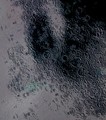
Good choice of dof. Normally I don't like a blurred foreground but in this case it works. The things that I feel will cause this photo get a low score are:
the crop. Why leave the top part dark like that? Does it add to the composition?
the texture. It looks overprocessed.
the white spots. the ones in front aren't as distracting as the ones in the back but try not to lose the details in the light spots. Otherwise the voter thinks you lost control of the exposure.
Pretty - and a great sense of detail too. Given the rigidity of the composition, that small element top left is a touch unsettling, but not major really. I like the angular plane of the focus. Not a shot that makes one catch one's breath - but you can't shoot them all the time, can you?
severe foreshortening revitalizes this cliche. Not sure I like the crop, though. The band of black at the top seems boring. I bet you could crop some of it off.







 Add photograph to your favorites
 Add photographer to your favorites


 Photographer found comment helpful.


