Thanks for all the comments!
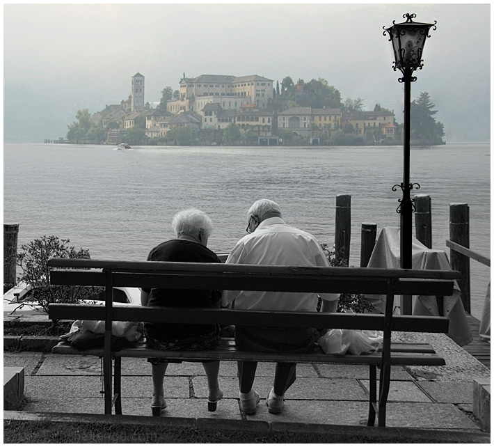
Obviously I've seen the biggest problem with it, that the bench is not parallel to the horizon line. I thought at the time there was nothing I could do about it short of moving the bench parallel to the view and re-shooting the photo, which was out of the realm of possibility :). How wrong was I! It just occured to me much later that I could simply use Transform option in Photoshop to straighten it out. Took me all about 10 sec to do it, and here is the result
Live and learn... Photoshop. I think I lost at least half a point on this stupid mistake...
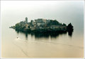
By the way, this is another shot of the same Island of San Giulio
What a beautiful place!
Even though some people on DPC just don't like selective desaturation, doesn't mean we all hate it. I like when it is used in the right situation. This is the right situation.
To me this depicts the darkening of the years and perhaps they have great ahppy memories of the island.
My only thisng I would say bothers me....I feel like they are going to go sliding off the end of the bench. I know you wanted to keep the island straight, but the foreground has a mighty tilt to it.
Very nice technique in post processing. I like the black and white foreground and the colored island in the distance. Nice subject, too. Warm and fuzzy.
I'm not sure this needs selective desaturation, I think I'd prefer it without. But I really like the image itself, the portrait of this elderly couple in quiet conversation sitting infront of such a beautiful, almost timeless, view.
8 - Good photograph. Some nice character elements, a few distracting ones, like the selective desat, but do wonder (if the clothing color suited) whether leaving the couple in color as well, may have made this even better, but your call - obviously. Judging by your title, perhaps you wanted the island to dominate/visually offset.
Is this Orta? What a wonderful place! The bench seems to give the photo a tilt to the right even if the island seems straight which takes away from the overall feel. Looks like a cloudy day and the mist works well with the muted colors. Nice photo in a beautiful setting.
This is so awesome! One of my favorites in this amazing challenge. I just love how just a hint of the color across the water comes thru without making it look selectively desaturated. Amazing job! Think I better add this one to my favorites :) 10
while I have no idea what sort of colors you had to work with here in the foreground, I find the selective desat to be a somewhat odd choice for this...having said that, it's a lovely shot with an interesting mood
A fantastic scene/setting and an emotive photo. Not a fan of the partial desaturation on this at all. This scene begs for complete color, even if the color tones are on the flat side. Nonetheless, great job!
Good photo! Maybe just a little too much on the color for the buildings as they pull a little too much weight in the composition but I dont think it is enough to detract from the idea. Nice.
This is such a cool shot. I feel like I just caught a glimpse into the world of forever sweethearts. Maybe the island is a "mirage" of where they spent their young lives together. The island is great and the lamp post is very cool. I think this was a good use of selective desaturation too. Very nicely done. 8
90% of this shot is really spot on, the detail from front to back is very impressive, and the colours are just right. The bottom is spoilt by the bar or something that runs across at a wonky angle. Would probably have been a tricky crop.
Awesome. Simply awesome. Very very good capture. That darn bench! I wanted to say the horizon was crooked, but then I saw that, no, it is a crooked bench. It really adds a lot to the image.





 Add photograph to your favorites
 Add photographer to your favorites

 Photographer found comment helpful.


