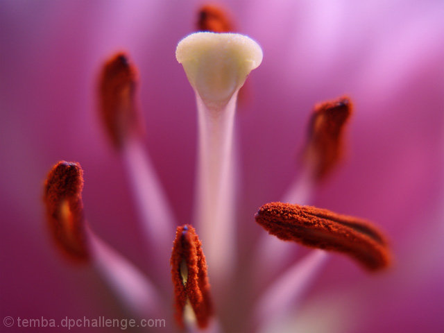
Tried out my new macro extension lens. I know this is probably quite recognisable, but I loved the colours and was pretty impressed with the detail. I thought of the alternative title of 'Dominance' but decided to go with Alien as I think it does look rather extra-terrestrial.
Shot in RAW and converted using Olympus Master. Very little editing. Small levels adjustment, some minor cloning out of pollen marks and resized.
Statistics
Place: 37 out of 285 Avg (all users): 6.1801 Avg (commenters): 7.7000 Avg (participants): 6.0114 Avg (non-participants): 6.3836 Views since voting: 1164 Views during voting: 245 Votes: 161 Comments: 14 Favorites: 1 (view)
I love macro photography, the abstract feel. And this image is stunning.
I am thinking of buying a extension lens and this might just do the trick for me.
Ansi
Excellent image quality....a nice shallow depth of field with sharp clear focus on the subject. The colors really pop on this one...makes you sort of say "ooo" as soon as it opens.
CHOICE OF SUBJECT
The biggest drawbacks to this photo to me are the following. I immediately recognized what it was which takes away from my feeling it is truly abstract. Secondly, I see so many flower shots on DPC that flowers automatically give me a negative reaction. While you might think this is just my opinion, I have found that a lot of people complain about the overabundance of flowers so it might be something to take into consideration. The fact that you scored in the 6+ range with this AND it's a flower shows you had a REALLY GOOD flower!
COMPOSITION
The composition is very good on the photo but I have to agree with one of your commentors below. Had this been cropped more square you might have been able to achieve a less recognizable photo and therefore would have captured the essence of "abstract" a little better. I might have pulled in the sides on the crop and made it a little tougher to recognize.
CREATIVITY
I often score pictures higher that are creative in some way. Unfortunately this doesn't show a lot of creativity. As I said, flowers seem a bit overdone so unless you've done something unexpected, it doesn't stand out for me.
POST PROCESSING
The post processing looks good. I can't think of anything I would like to have seen enhanced or done differently. Looks like you just got a nice purely "good" photo that didn't need much. The only drawback to this is that it's an "advanced editing" challenge so you had more room to play with the photo which you didn't have the chance to take advantage of here. This would be a great shot for basic editing because it seems you just had a great photo that didn't need anything. Great job.
I think I would have scored this a 5 if I were voting because, as I said above, the subject is too easily recognizable and therefore doesn't really seem "abstract" to me and because I have a hard time enjoying pictures of flowers. Again, you shouldn't care whether I like flowers or not but I think I wouldn't be the only voter who tends to vote less favorably for flowers.
This shot stands out from many other challenge entries because it is not 100% recognizeable at first glance. It is not however, extremely abstract, IMHO. That aside, the colors are brilliant, the focus shart, but I would have liked a little more DOF, particularly on the close tips.






 Add photograph to your favorites
 Add photographer to your favorites

 Photographer found comment helpful.


