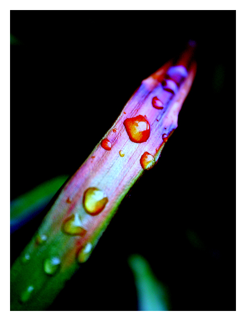
Focus is very good. Depth of field is a bit shallow for me. I like the way the other green bits in the picture are soft. However, I would have liked to see all the drops in sharp focus.
Color, saturation and hue are good. I like the change of the color across the bend of the plant. I realy like the large water drop in the red section.
Brightness and contrast are good, and lighting is good as well. I like the highlights on the water drops. Adds depth and texture to the piece.
I might have like a little thinner border.
Overall a very nice picture, one I could see hanging in a gallery.
The colors are a bit awkward. You have tried to cut down on the distractions within the frame. That is one of the hardest parts for me. Maybe the curves adjustment caused the color problem. I almost always convert to b/w when the colors start going goofy. With the pcture as it is, the voters will knock off points for the color, with b/w you would not lose those points.
I love the different colors on the leaf and that your drawn into the photo. I usually don't like borders because they distract but on this photo I didn't even notice at first.





 Add photograph to your favorites
 Add photographer to your favorites

 Photographer found comment helpful.


