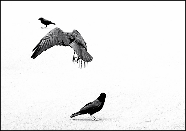
I really like the crow in flight. The others...not so much. The pebbling at the bottom of the frame is somewhere between interesting and distracting. 7 Rob the Swash
Cool effect I really like it but, you should have cropped to remove 2 1/2 inches off the right making it portrait. You might lose some detail but the appearance would be MUCH better.
The blown out effect in the upper right doesn't work negatively here, in fact I like it. I get the feeling these are three competely different birds who don't want to have anything to do with each other, funny. Good - 8.
This shot leaves me confused. There is not enoough detail. What is the top bird sitting on? Is the landing bird landing or striking??? What kind of birds are they? What is the habitat? The birds by themselves don't tell a story... There needs to be just a little more visual cues to give the shot some meaning... Does any of this make sense?
TC
I love the bird on the ground and the big one in flight but the other one seems a bit out of place as if he is just sitting in mid-air. I also think that black and white really works well for this shot.
This is nifty. I'm glad you made it black and white. I think I'd lose the little guy on the top left. I think he's a little distracting from the bird in flight. Nevertheless, I like this a lot. If I could vote in this challenge, I'd give you an 8...and then probably reconsider and up it to a 9 or 10. LOL! Good luck.






 Add photograph to your favorites
 Add photographer to your favorites

 Photographer found comment helpful.


