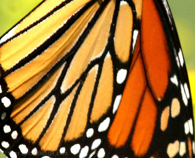
Focus is soft, depth of field does isolate the subject from the background. I don't think depth of field is a problem here, as the subject appears equally soft across the image.
Color, saturation, and hue are good. Brightness and contrast are good as well.
The background appears a bit grainy. Likely due to the ISO 400 used. A lower ISO would have helped with this, and it looks like you hade enough speed avaiable to stop any motion blur.
The other thing I would suggest is rotating the picture 180 degrees. In this view the wings hang down. The energy seems drained. The other way the wings would point up, and appear to have more energy. (It's fun to have a flat panel display that I can rotate.)
I do like the colors and shapes, the biggest point as mentioned by others is the focus. It really needs to be sharper.
It could be sharper...is the grainy affect something that was added in post-processing? I'm not sure it works great for this. I like the overall color and pattern but I think it would be more affective if it had been cropped to eliminate the areas of green in the background.






 Add photograph to your favorites
 Add photographer to your favorites

 Photographer found comment helpful.


