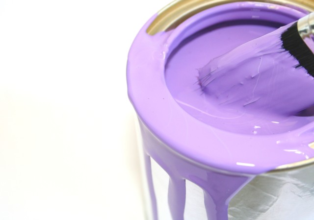
This is a really nice photo. The bad thing (for the challenge) is that it is "nice" and not "wow'. I think if you could have made the purple a more vivid shade that would help a lot. Currently it has a pastel feel to it.
The composition is good and the brush adds a nice element of interest to draw the eye in.
nice idea - I like the "juicy" look of the paint. The focus looks a little soft in areas - like the front lid. I might have like it sharp as a tack throughout to see those glossy reflections better. Still, good work.





 Add photograph to your favorites
 Add photographer to your favorites


