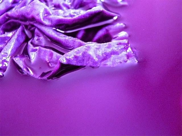
What I did for this photo was take a paper towel, then soak it in water and purple food coloring. The photo is of a corner of the towel floating in a pool of the food coloring. I used a simple halogen light.
As for post-processing, I used hue, saturation, temperature, sharpen, gaussian blur, and noise reduction.
Statistics
Place: 201 out of 290 Avg (all users): 4.6284 Avg (commenters): 4.1667 Avg (participants): 4.2474 Avg (non-participants): 4.8537 Views since voting: 725 Views during voting: 337 Votes: 261 Comments: 8 Favorites: 0
The problem with abstract at DPC is that it doesn't please everyone and it usually gets voted down when "we" don't get it.
but... "Hello... This is an abstract!"
I feel that.. don't let the score bother you.. I felt that it should have been at least a 5.. so.. hang in there.
Technically, there could be a few improvements.
1) the lighting to show less of the whites
2) too much spaces work against abstracts. Zoom in and give it a really nice tight crop..
The technicals: I think a big part of your issue is actually the halogen lamp. They give off such a shifted color that sometimes it's hard to work with, especially when you are going for purple (cool) rather than yellow (warm). What happens in PP is you get pixelation and saturation problems in the highlights like you see here. There are also noise issues, which seem to be a no-no on DPC.
The feel: nicely abstract. I may have included more of the paper towel and less negative space along the bottom.
The game: abstracts always have a tough time outside abstract challenges here on DPC.





 Add photograph to your favorites
 Add photographer to your favorites

 Photographer found comment helpful.


