I can't believe some losers (3 to be exact) gave you a "1" on this picture; and 13 gave you a "2"! I personally gave an "8." People that graded this so poorly either need to get their monitors fixed or have the eyes examined. I really have to wonder about the motive of those that graded this picture so poorly.
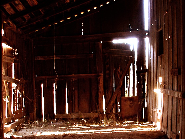
great idea. I like the shadows on the ground and the way the light bleeds through the cracks in the barn. there is also a nice gradient of values from the upper left to the lower right.
I'm being frank - not to offend. The cropping, composition and distance is good. The light is harsh with too much fringing. I like the idea very much, but it seems that the process was executed poorly. This is just my opinion. 5 Ruthann
Beautiful photo! I like this a lot. Only thing I could nit-pick about is that the bright light in the upper right corner does not fit to the rest of the photo. It's a touch too bright and also has a blue tint. If it would be the same like the bright light in the lower right corner (on the right wall of the barn) then it would be perfect. Unfortunately I don't have a suggestion how this could be achived. -Stephan
Sure reminds me of some of the old barns. I think this would be a very difficult subject to capture, and you did about as well as I could hope for, but.....the back wall is too dark, the glare in places is painful and the whole thing seems just a little off focus. 6 Swash
wow... this looks really old. Could just be me, but a lot of the image looks out of focus and a bit too dark. It appears as though the sun is behind that wall, which would cause the bad backlighting-- it obscures an otherwise great photo! --7-- sohr
Something old. Use your photographic technique to emphasize the age of your subject. Composition - quite good Technical Aspects - quite good, like the lighting Meets Challenge - yes Visual Impact / Originality - quite good / good
At first, I felt that this photo was too dark, but after studying it more, I kind of like the effect - it gives the light and cast shadow more prominence. I think that I would have like to have seen it cropped right at the top of the crossbeam just above the large upside down "L" shaped light on the right hand upper side to give it a little more balance. lhall
Nice idea and a good setting but that blown-out light through the cracks is too much. Perhaps a low intensity fill-in flash inside this building would have brought out more interior detail as well as dropping the exposure reading on the camera - removing the over exposed lights.





 Add photograph to your favorites
 Add photographer to your favorites


