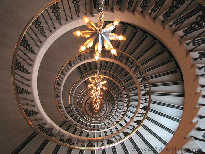
This is an exceptional staircase image. There is enough variation in pattern, lighting, and texture to entice the viewer to look around and fully explore the depth this image offers. The composition of this image is strong enough to be in the top twenty of this challenge. So why didn't it score higher? I think it might be the overall coloration of the image. To my eyes the whole image has a copper cast to it from the chandelier. If you desaturate the red channel just a touch, the image appears to gain a significant amount of contrast and pop. Another option, desaturate the red channel and convert to B&W. This is has a lot of potential and I encourage you to play around a bit in post processing to see how many versions you can come up with.
Feel free to PM me if you have any questions regarding this critique.
Jeffrey, this is AWESOME! Man, that is 2 Free Studies in a row that you have kicked butt! Congratulations on such a strong finish in such a tough challenge! This is really a great phnoto!!!
7 - Nice. Just wish the chandelier(?) (lights) was 'straight', but perhaps difficult to rotate if this is what you had to work with. Like the depth, including dof. Colors are nice - the coppers tweaked a fraction may have given this a little extra as well, in my opinion. Perhaps also, a little less space on the left, but minor.
Wow! What a pattern. really neat shot. The repetition of not only the stairs, but also the landings is really nice. You've captured this wonderfully! I guess the only nit-picky thing I can think of is to see a touch more contrast.






 Add photograph to your favorites
 Add photographer to your favorites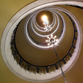


 Photographer found comment helpful.


