Hey there from the Critique Club
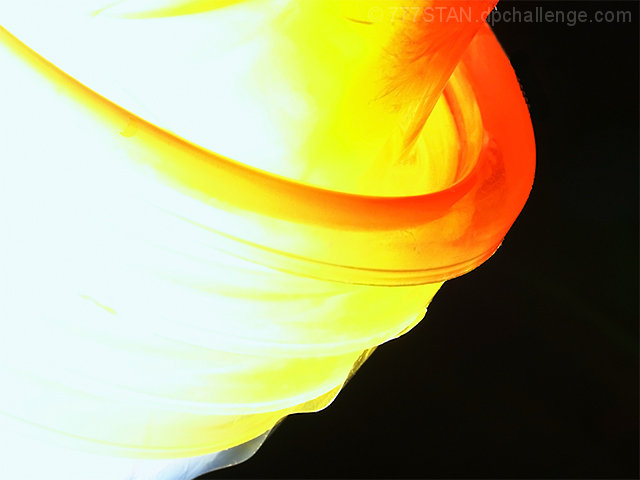
Camera Work/Technical: I'd like to see the original to see what was erased and cloned. It looks like you cloned around the rim, thus leaving a harsh edge around it. The color is spectacular, as is the contrast you created.
Lighting: The lighting is a bit too harsh, as you lost a little too much detail on the left side. The idea is very creative, and I think that toning the flash down just a bit would have improved this one tremendously.
Composition/Content: Again, very creative content that very nicely met the challenge. The tilt also nicely adds to the abstract value of the image.
My Opinion: I think that the harsh edge left from post-processing really took this one down in score. With a few slight adjustments, this one could have been up near the 6 range. Great idea and awesome contrast.
Eric
|






 Add photograph to your favorites
 Add photographer to your favorites

 Photographer found comment helpful.


