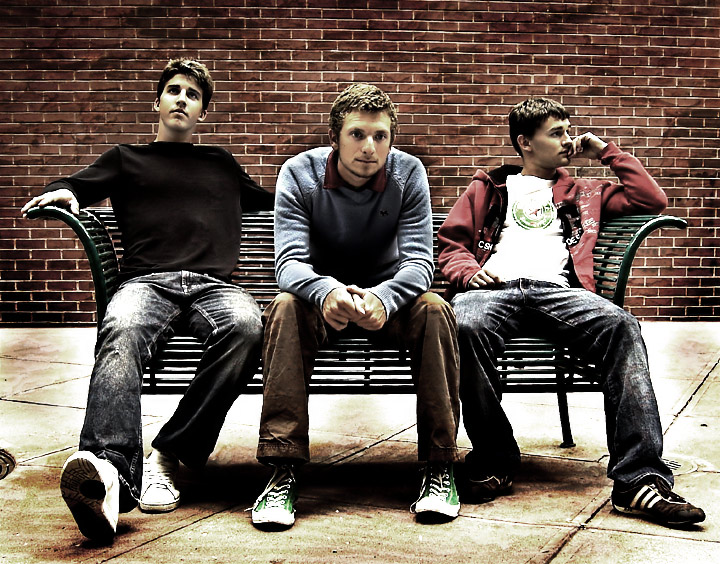
I was taking band photos for this band at the begining of the month. I didn't even know there would be another open challenge. I edited this photo gave it to the band, and 24 hours later 6 other bands contacted me about doing a shoot for them! I said I need to put this in a challenge and see how many 5's it gets!
42 fives. There I have my answer.
Here is the photo before PP.
Statistics
Place: 92 out of 615 Avg (all users): 6.2074 Avg (commenters): 7.5333 Avg (participants): 6.1986 Avg (non-participants): 6.2381 Views since voting: 3820 Views during voting: 363 Votes: 188 Comments: 27 Favorites: 7 (view)
macrothingalready nailed everything I was going to say. I also wonder if it would benefit to straighten out the lines of the wall with the transform tool? They are off just enough to be a slight distraction, but not enough to appear intentional.
I really like this. You have a great eye for color and grungy processing. The image is interesting, balanced and has a lot of depth. Great work.
It's also thrilling to see that you got many referrals from this shot! Congrats! I think you'll do very well as a band photographer.
8 - The processing complements the characters in this shot very well in my opinion. Colors are good too. The main things that detract (and fairly minor) in my opinion are: the (dark) visible manhole/drain/something on the left and the skin/lighting on the young gentleman's face on the left (just seems slightly 'inconsistent' with the other two), but fairly minor. The 'blown' areas don't detract and actually add to the good character overall captured, including of the individuals. Good image, which no doubt will be treasured by each of the three.
I really like this photo. Feels very three-dimensional. People may find the drain on the left distracting though. I think it will do very well. Top ten, I'd say. Best of luck!
I like this a lot. The creases on the pants of the two outside guys and the shirt of the center guy line up well with the lines of the bench. I also like that none of them are looking at the camera and I like the muted colors. Very nice job.
something in the processing here doesn't sit well with me. like too much shadow/highlight or something. it has a look that shows up a lot in advanced challenges. too glowy for me.





 Add photograph to your favorites
 Add photographer to your favorites


 Photographer found comment helpful.


