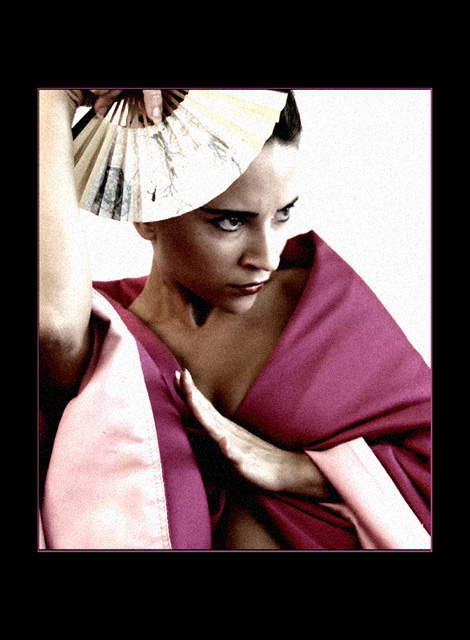
Kabuki, a Japanese traditional form of theater, has always been colored purple to me, the color of dark mystical passions and controlled desires.
So here\\\'s where I got the idea of this photo.
I\\\'ve made some adjustments to the picture and I hope they all were legal:)
desaturate-fade desaturate-more brightness and contrast-filtered several times (2 times) in NeatImage-brightness-contrast again.
I\\\'ve also made another version of this picture with more filters which I like most but since the filters are not allowed here...
:)
***************************************
thank you so much everyone who voted for my picture!
thank you so much for your wonderful helpful comments!
Statistics
Place: 118 out of 290 Avg (all users): 5.2610 Avg (commenters): 7.1538 Avg (participants): 4.8000 Avg (non-participants): 5.5291 Views since voting: 2807 Views during voting: 439 Votes: 272 Comments: 25 Favorites: 4 (view)
My main point of critique on this shot would be the lighting. It is very harsh on the face. It is also very dominant on the left side of the frame, where there is too much light on the arm, cloth and thing in the hand. This draws the eye away from the person.
The composition is basically ok, but I do not like that elbow pointing toward me. I can live with the border, but don't like the noise (I like noise sometimes, just not here).
Congratulations on a solid score for your first challenge entry. As you can tell from the comments you received during the challenge, large borders are a love it or hate thing at DPC. The real disadvantage of such a large border is that it reduces the viewable size of the image for the voter. The smaller the image, the less time the voters are willing to spend looking at the image.
As for what could be done to improve your score. I think you achieved your intent for this image very well. It has a very artistic feel to it, with the desaturated colors and the film grain look. However, both of these effects generally don't score that well at DPC. It seems that the majority of voters like saturated colors and sharp images. So what do you do, stay true to your style or change for a better score? I encourage you stay true to your style, as images like this are appreciated by many members of this site. Just remember not to take the scores personally, as they will not reflect the true quality of your work. Thanks for submitting this image.
Feel free to PM me if you have any questions regarding this critique.
I like the grain, I like the composition, the POV, and the colors and tones used. I hate the overwhelming frame which to me, by its size, has equal weight with the subject.
The premise, costume, model and composition are all very fine. The light is quite harsh on her face, her down turned hand and raised arm. The noise, whether artiscally added or not, distracts me from the models beauty, especially on the white background. I think the frame would have better with a thinner area of black. The images shows a lot of promise and working on your lighting would have helped this a lot. This is all just my opinion and I usually don't have a clue when it comes to protraiture.
this shot is great fun. All the compositional elements are there, but the model is being just a shade too serious, and at the same time looks as if she is about to break into laughter. A truly enjoyable picture.
Like the photo, the composition, the colors, the graininess. Good drama. Don't like the oversized black border. Thin black rule and thin pink rule would have been good.
By itself, this is a compellingly beautiful shot. Great framing that totally works with the model's pose and composition. So very well done and the tones are remarkably alluring. For this challenge, the hint of purple may be a bit of a stretch. Great photo all the same and certainly one to be very proud of whatever the outcome.






 Add photograph to your favorites
 Add photographer to your favorites

 Photographer found comment helpful.


