Hey, Tony, just wanted to let you know that some time ago i added this img to my Fav and it has become one of few pictures here that i really cherish. It has character, is devoid of gimmicks and all that other crap ... Some comments here regret the presence of the string. I like that string. True, because of its light value one's eye is just about to fall off the picture plane but it does create that lovely triangular shape. I'm very partial to triangular shapes - always try to work them in if i can - they delight my eyes.
What i really, really would like to see with this image is duotoning with a blueish tone (no, it won't give it a bluish cast but suspect that it would give a very nice subtle touch). I thought you had PS (people who don't have PS are losers - they just don't know the kazilion of wows they're missing out on) but if you don't and can't duotone, i would be happy to give it a try for you. I may be mistaken but thought duotoning would enhance this image.
PS: when i voted on this img way back when i gave it a 4! I just can't look at 150+ pictures and expect to really see all of them, let alone give them the score they deserve. I have therefore stopped voting as long as i won't submit. Besides, it took oodles of time and started to feel like "work" (without being paid for it, hey come on). Instead, i comment, and yack away, on the occasional picture whenever the mood strikes me. The new site just restored thumbnails to one's own pictures and favs. Voilà.
Now, don't let all this praise go to your head! ;) Journey
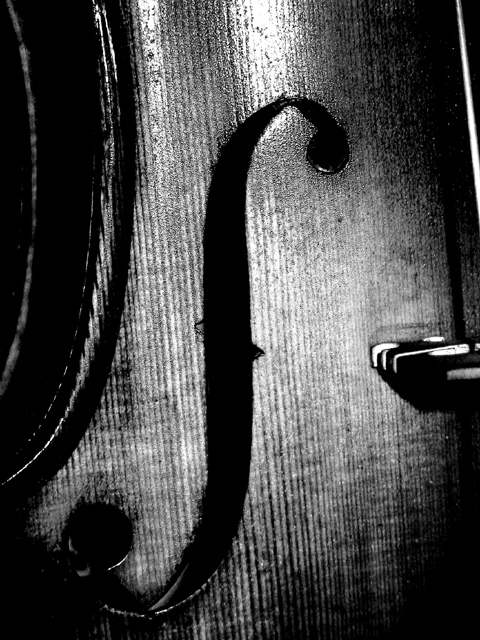
This violin is actually NOT old... well, it was made in 1980's by a violin maker in NYC and have owned it since late 80's. I do have/had violins that were made in the 1800's but they are not with me (my cousins have them now). If I had to do it again, i'd probably do it at a slightly different perspective -- i was trying to show what a violinist sees when he plays, looking mostly at the left side of the instrument.
nice curves in the picture. two gripes. 1: too much contrast. Methinks you cranked it way up, and that's really not necessary. 2: nasty glare. try different lighting to get rid of that. I like the composition, though.
I sort of like this but... Though I think the angle of this photo is centred around the f shaped hole (I have no idea what those are called) I find the slight angle of the wood grain distracting. If it was at a steeper angle it would work but this is too close to the vertical and throws me when I look at it.
Dark, with harsh glare on the upper part of the shot. In the lower part of the shot, the darkness overwhelms the shot. (personal nit: did it look bad in color?) 6 Swash
Ooh! I realy like the tezture of the wood grain and the monotone makes it look old. the contrast is a little strong for my tasts but that in no way detracts from the picture. What I am having trouble with is the composition, the curved symbol or cutout, whatever it is, as the center of focus needs to be at a prominate point of the picture, ie. center or at a third, In my opinion. Even so this is one of my top ten.
nice work! The only suggestions i have for this one is to either include the entire string or remove it completely... I also would like a diagonal orientation, but that is just my personal preference... great shot :) = 9 - jmsetzler
I would have personally liked this in color better, I think. But the grain of the wood looks really good. It's kind of blurry though, sharper would have also been my preference. I like it overall, though.
I like the bw on this, and how you have captured the wood grain. maybe shift the frame a bit to the left so that the partial string is eliminated. karmat
Nice. Simple yet bold elements. Subject fills the whole frame with nothing extraneous to distract your attention. Seems to lose focus farther down the photo though as if focused on the light source at the top.
Something old. Use your photographic technique to emphasize the age of your subject. Composition - quite good Technical Aspects - quite good Meets Challenge - yes Visual Impact / Originality - quite good
Wooo - this is lovely. Lovely texture and lighting. I like the close crop. I think the only thing I'd change is that I would have tilted the violin slightly more to the right so that the strings were vertical. Right now it's neither angled nor straight. Even so - that's a nit pick. Lovely photo. Very well done.
Nice use of black and white. I would have liked to see a little more of the instrument so that you could have told that it was a violin or that it was a string instrument at least from the picture and not needing the title.
wow, as an ex-violin player, i love this--i would have given a copy to my grandfather (he used to play in a symphony.) the lighting and contrast is just perfect. the only thing i might have done differently is pull out just a bit to get a hint more of the strings on the right. anyway, my favorite shot so far! 9--amitchell





 Add photograph to your favorites
 Add photographer to your favorites

 Photographer found comment helpful.


