Yep, this is a reshoot of my desolation challenge entry -
I wasn't happy with the clarity and DOF in the first one (looked alright small but not as good as I wanted printed large)
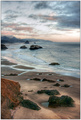
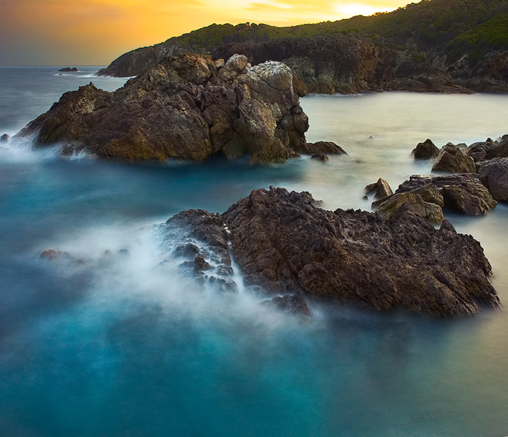
and now that I've worked out hyperfocal distances I thought I would have another go. But being a different time of year - and high tide instead of low - its quite a different photo. The original version had lots of waves crashing over the rocks but on this day the sea was almost dead flat.
Quite a bit of postprocessing - Shot RAW - merged two versions of the same photo, one developed for the sky and one for the rest of the photo. Otherwise pretty normal editing, Curves, 2 hue/sat layers, shadow/highlight (only on the rocks) and a bit of neatimage to clean up what looks like noise in the forground but is really just a bit of wave action.
Then mucking around with gradient maps I used the purple/orange preset and changed the blending and opacity and I really liked what it did to the colours.
Statistics
Place: 3 out of 615 Avg (all users): 7.1211 Avg (commenters): 8.0000 Avg (participants): 7.0541 Avg (non-participants): 7.3571 Views since voting: 10233 Views during voting: 371 Votes: 190 Comments: 58 Favorites: 47 (view)
The yellow sky definitely creates a better feel fro your title than the purple sky; the purple is more smooth and calmer, and the complimentary orange yellow and blue create a vibrant uneasy feeling- so do the treacherous rocks.
I see that many have sang your praise already and I'd like add my two bits to your already lengthy list of accolades. The surreal colors and the sharpness of this picture made it an immediate add to my favorite list. Thank you so much for this image.
You certainly got this one off to a "T". With all the excellent pics you do, I was really surprised to read that this is your first ribbon. Congratulations Tim.
gave this a 10...well done on the ribbon...the colours are amazing...I couldn't believe this was your first ribbon Tim! I thought you had stacks from the quality of your pics and comments...welcome to the club!
Aw man, an awesome shot! I would have been equally fine with this finishing in first. I just love blurred water. Congrats on ribbon #1 and doing it in a Free Study no less!
I remember one a lot like this in another challenge. It is an amazing shot, I love the tonal range of the blues, in contrast with the yellow sky. It is soft where it should be soft and sharp where it should be sharp, and overall just a great capture. 10
Ohmygoodness! How dramatic and beautiful! Oh how I would love to get this effect on my water photos. I need to keep trying because this just blows me away!
beautiful. More sundown lighting could of been available. Maybe if you took the photo 10 minutes earlier or so, but the rocks are too dark and sun lighting would of helped since the rocks are the main subject.





 High Tide
 Add photograph to your favorites
 Add photographer to your favorites


 Photographer found comment helpful.


