Critique Club Review:
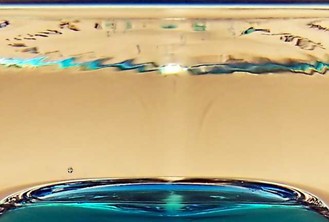
Color, saturation and hue are done well. Focus and depth of field are excellent.
A lighter background color might have been beneficial here. You have the nice clear glass and the brilliant blue. In comparison, the background almost looks a bit dingy.
I don't know if there was a way to emphasize the distortions, that some saw as marks, in the glass. If they were more pronounced you could see the top of the picture as connected to the blue in a sort of tornado effect. Otherwise, it might have been better to clone them out. (Permissable in this challenge as it is advanced editing.)
|







 Add photograph to your favorites
 Add photographer to your favorites


 Photographer found comment helpful.


