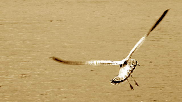
Good clarity on the seagull's face while getting a strong sense of motion, too. The framing is questionable, it's usually more favorable to include more of what the subject is looking at. I always question monotone...so I'll ask why? 7 Rob the Swash
interesting shot, I like the contrast between the slightly overexposed back of the gull and the high contrast part of the image as opposed to the *fairly* dull low contrast water.... it works well, I think that the duotone effect makes the image feel perhaps hotter (temperate-wise) than perhaps it would have looked it colour. I have changed my mind, I actually gave this a 6 to start with but after looking at it more closely I think it deserves an 8 as much for the post processing as for the image itself. Good Luck, Todd. 8
Not sure about the hue you've chosen for your duotone, I think playing about with Colour Balance could have done wonders for this shot. Nice composition. 6






 Add photograph to your favorites
 Add photographer to your favorites


 Photographer found comment helpful.


