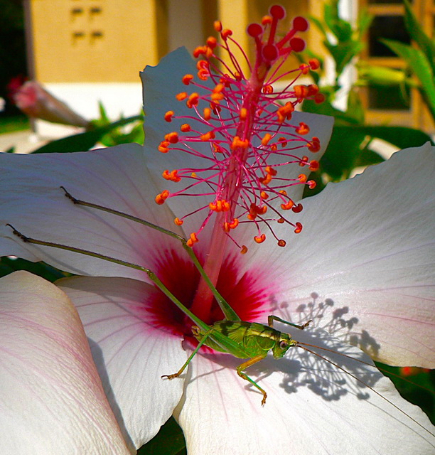
Composition: Composition is good on the foreground (flower & hopper). The biggest issue I see with the composition is the background which is very distracting.
Subject: Subject is of a nice flower could be considered typical. However, the placement of a secondary subject (hopper) makes this entry stand out beyond the normal flower entry.
Technical (Colour, focus, and light): Focus is good. Color and lighting is good. However I feel the image could be brighter and might benefit from an increase in hue saturation, particularly in the green.
It is my hope that these insights are helpful, and constructive. If you have any questions regarding this critique, please feel free to PM me. Also feel free to PM me with any feedback on this critique. And please remember to mark it "Helpful" if you found it so.
Nice picture. My only suggestion would be a closer crop to lessen the background distraction. Not sure how you could do that however co nsidering the horizontal and vertical aspects of the subjects (stem and grasshopper).
I like this, the best thing for me about the picture is the cool shadows. Maybe you could have made more of them and also got rid of the yellow house in the background, which I find a bit distracting. I like the colors of the bug and the flower, they compliment each other nicely.





 Add photograph to your favorites
 Add photographer to your favorites

 Photographer found comment helpful.


